7 Tips for Optimizing Your Looker Studio Dashboards

Looker Studio is a powerful tool. You can use it to create data visualizations that help businesses make better decisions. However, with Looker Studio’s many features and customization options, it can be overwhelming to know where to start when building dashboards.
In this blog post, we’ll cover some tips for optimizing your Looker Studio dashboards to ensure that they are effective, efficient, and easy to use.
Let’s get started.

Optimizing Your Looker Studio Dashboards
Start With a Clear Goal in Mind
Before you begin building your dashboard, it’s crucial to have a clear understanding of what you want to achieve. Do you want to track key performance indicators (KPIs), Monitor trends over time, or Compare data across different groups or time periods?
Your dashboard should have a specific purpose, and everything you include should support that goal.
You can draw a rough sketch on paper of how you would like your dashboard to look. This can help you have an idea of the main goal of the report.
Keep It Simple
Adding as many charts, graphs, and tables as possible to your dashboard can be tempting, but more isn’t always better. You might end up cluttering the report, making it seem complicated or hard to understand.
So what do you do? As mentioned above, ensure that you have a goal and then focus on the essential information you want the report to show.
Next, present it in a clear and concise way. You can do this by using minimal design elements and removing unnecessary details, features, and charts.
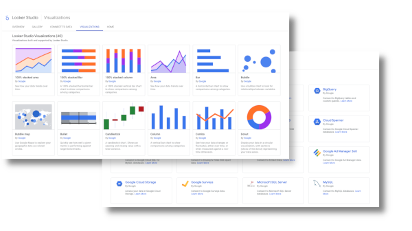
Use the Right Visualization for Your Reports
Different types of data are better suited to different types of visualizations. For example, bar charts are great for comparing values, while line graphs are good for showing trends over time. Choose the visualization that best communicates the information you are trying to convey, and use it correctly.
Make Use of Filters and Parameters
Looker Studio’s filters and parameters allow you to customize the data displayed on your dashboard for different audiences or time periods. For example, you can create a dashboard that shows data for a specific region or product line or compares data from different months or years.
Use these features to give users (of the report) the flexibility to explore and analyze the data in a way that is most relevant to them.
Use Alerts and Notifications
Looker Studio’s alerts and notifications can help you stay on top of changes or trends in your data.
You can set up alerts to notify you when certain thresholds are reached or when there are unusual spikes or dips in your data. This can help you identify problems or opportunities faster, enabling you to take the necessary action.
Test and Iterate
Your dashboard is not a static entity – it should evolve and improve over time. After you’ve built your dashboard, take some time to test it out and see how it performs.
Ask for user feedback, and be open to making changes based on their needs and suggestions. Looker Studio makes updating and modifying your dashboards easy, so don’t be afraid to experiment and try new things.
Collaborate and Share
Looker Studio’s collaboration and sharing features make it easy to work with others on your dashboard.
You can invite team members to collaborate on your dashboard or share a read-only version with stakeholders. This can help ensure that everyone has access to the latest data and insights and can contribute to making better decisions.
Better Dashboards, Better Business Decisions
This blog post has helped you learn a few ways that you can improve your Looker Studio Experience.
Looker Studio is a powerful tool for creating data experiences that drive better business decisions. You shouldn’t be afraid to try new ideas. Use the above tips to improve your dashboard-building skills, and remember to optimize your dashboards. Check out our case study on implementing Looker Studio dashboards to see how you can unlock the full potential of your data.
To get the most value from your data, you should aim to have dashboards that are effective, efficient, and easy to use. To a happy experience building Looker Studio dashboards!