Google Analytics provides a lot of reports and it can be difficult to figure out which ones have the most valuable information for you and your business. The most-useful reports for you may not be the same as those for someone else. It will depend on your needs, strategy, and measurement plan. However, here are seven of the most-important Google Analytics (GA) reports that we believe every PPC professional must use. These reports will give you insight from the top of the funnel to the bottom; from acquisition, to landing, content, conversion and continuing engagement.
Traffic Acquisition Report
Let’s start towards the top of the funnel with the Traffic Acquisition report. This standard report will tell you the breakdown of how visitors have been finding your website. If you understand how visitors are finding your website, then you can adjust your ad spend to improve the return on your marketing budget. This report will show you which marketing tactics are working best to drive traffic to your site and which ones could be improved.
In Google Analytics, you get to this report by going to Acquisition -> Overview

It will show the breakdown of the source channels to your website:

You can drill down into this report further to find the external sites and the exact webpages that are sending traffic to your website.
Landing Pages Report
After knowing how visitors get to your website, you want to know which pages they are landing on initially. With this report you can answer questions such as:
- Which pages are seen first on your website?
- Which landing pages lead to visiting other pages on your website?
- Which landing pages lead visitors to immediately bounce from or leave your website?
- Are different segments of traffic landing on different pages?
- Which landing pages are best or worst at converting?
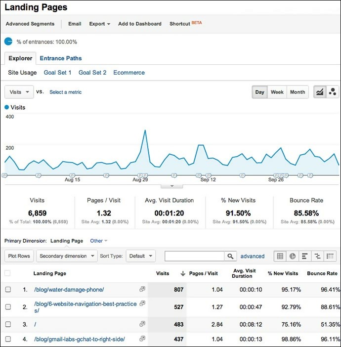
To view this report, go to Behavior -> Site Content -> Landing Pages

The report will look like this:

Content Efficiency Report
The Content Efficiency Report is one of the trendiest reports of all. It is a custom report that will provide you with insight into the content that is most engaging and which content leads directly or indirectly to sales conversions. Conversely, it will also show you which content is least engaging and could stand to be changed to improve performance. It shows you entrances, page views, bounces and goal completions.
Here is an example of what this report looks like:

Model Comparison Report
Who should get credit for driving visitors to your site when the visitor had multiple interactions (impressions or clicks) before conversion? Should the network generating the first interaction get credit, the network generating the last interaction, or some combination of all networks who had a part in driving the conversion? The default attribution model in Google Analytics is last click. With the model comparison report, you can look at several different attribution models to identify the stage in the conversion journey, where networks tend to have the most influence.

Top Conversion Paths
The Model Comparison report shows you one angle of the story of conversion. The Top Conversion Path report shows you another angle of that same story. The Top Conversion Path report shows you the frequency of different conversion paths. Depending on the settings you choose, this report can show you the source, medium, campaign, and keyword paths that result in conversions. One benefit of this report is that it will show you if people are taking more steps than what is necessary, to achieve conversions. Then you can figure out how to influence people with a shorter and more direct path. Here is an example of a report for a site that had long and short conversion paths:

Lifetime Value Report
Another useful pair of reports that describe different angles of the same story are the Lifetime Value report and the Cohort Analysis report. The Cohort Analysis report primarily shows you retention and the Lifetime Value report shows you revenue from a given cohort. Site users who are retained longer are more likely to contribute more revenue.
The Lifetime Value report shows you average revenue over time per user from the same cohort (a cohort is a group of users who were acquired on the same day or the same week). You can see how long it takes for users to peak in their spending. Do users tend to spend all that they will spend in the first week, the first two weeks, or some other amount of time? At what point could you intervene with an offer to encourage users to continue spending? How do different cohorts compare to each other?
Here is the typical view of the Lifetime Value report:

You can drill down further to see LTV by segment (in this case, the segment is the acquisition channel):

Cohort Analysis Report
The Cohort Analysis report shows you the retention rate by group users who were acquired on the same day, as you can see in this example:

This report will give you visibility into how long users continue to stay engaged with your site. Retention rates are probably very similar across cohorts as in the example above. This report does allow you to view retention by segments that you can define yourself, which will be much more interesting and insightful. This will help you get a feel for who your most engaged segments are and then you can focus on expanding those segments.


